Climanomics Analytics Platform
Scaling a climate risk analytics product for enterprise in 12 weeks
OVERVIEW
The Climate Service (TCS) is a startup that provides analytics for companies to measure the financial impact of climate change on their business and investments. The IBM Garage helped scale their product for enterprise and reimagined the end user experience to unlock the full potential of their analytics.
As a designer for the IBM Garage, I led the redesign of their analytics platform and designed a new data management experience from concept to delivery. I also worked with a visual designer from the IBM Garage to define a style guide and visual brand direction for the company.
THE OUTCOME
Clminomics, the new enterprise analytics dashboard and data management platform, launched in production in 16 weeks.
The designs I created were used in investor presentations to help close on Series A funding. The company has since been acquired by S&P Global and are named as a leader in climate reporting by Forrester.
OUR APPROACH
Enterprise scale with startup speed using the IBM Garage methodology.
We leveraged best practices from Enterprise Design Thinking, Lean Startup, and Agile to incrementally test our vision with small experiments that provide real user value.

We began with a 3-day design thinking workshop followed by 8 weeks of iterative and collaborative design, development, and user testing.
DISCOVERY AND ALIGNMENT
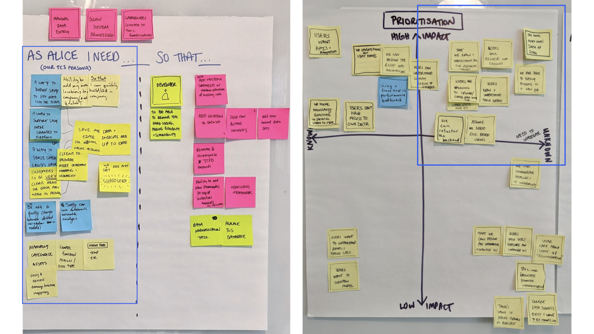
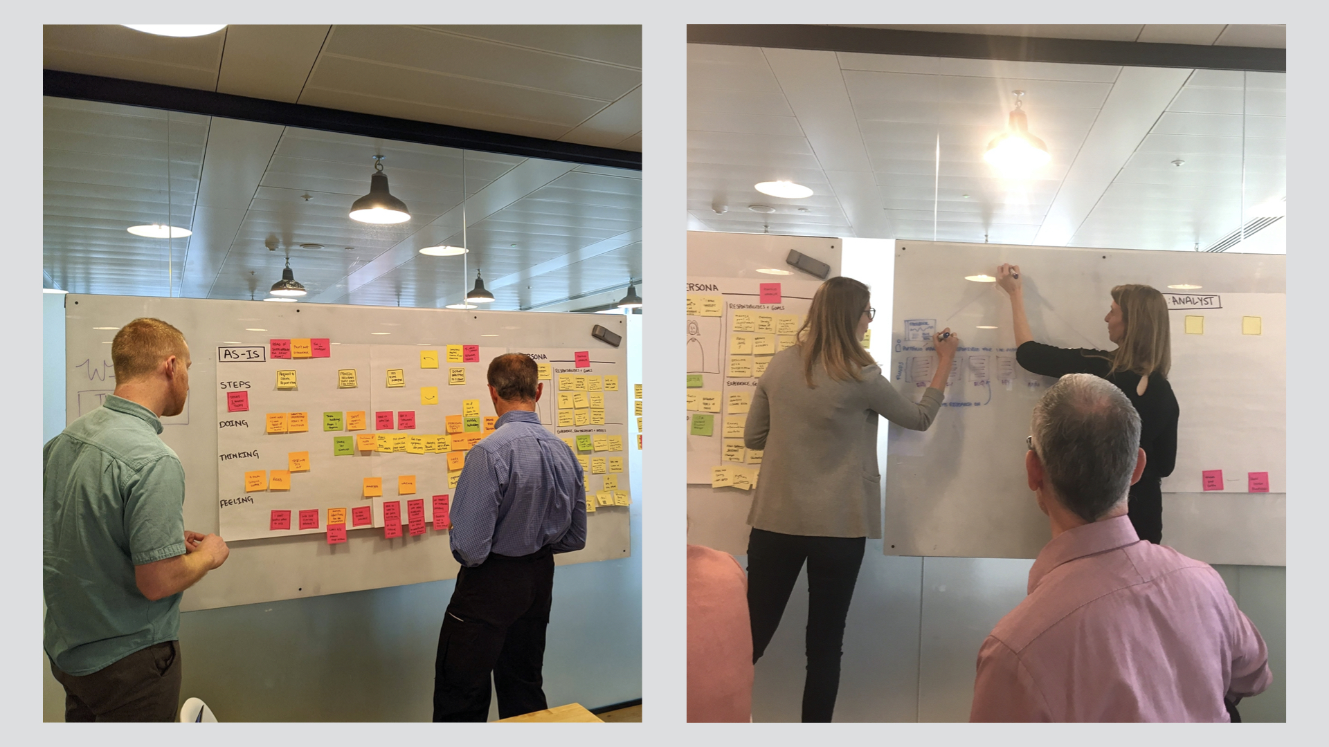
Design thinking workshop
A 2-day design thinking workshop brought together the startup's C-suite, developer, and data analysts, as well as two end users to collectively understand our user's needs and define a solution plan.
Understanding our users and their needs
Stakeholder and persona maps allowed us to identify and gain a collective understanding of the motivations and needs of our target user groups: Real Estate, Corporate, Portfolio Management, and Lender Asset Managers and internal Data Analysts.
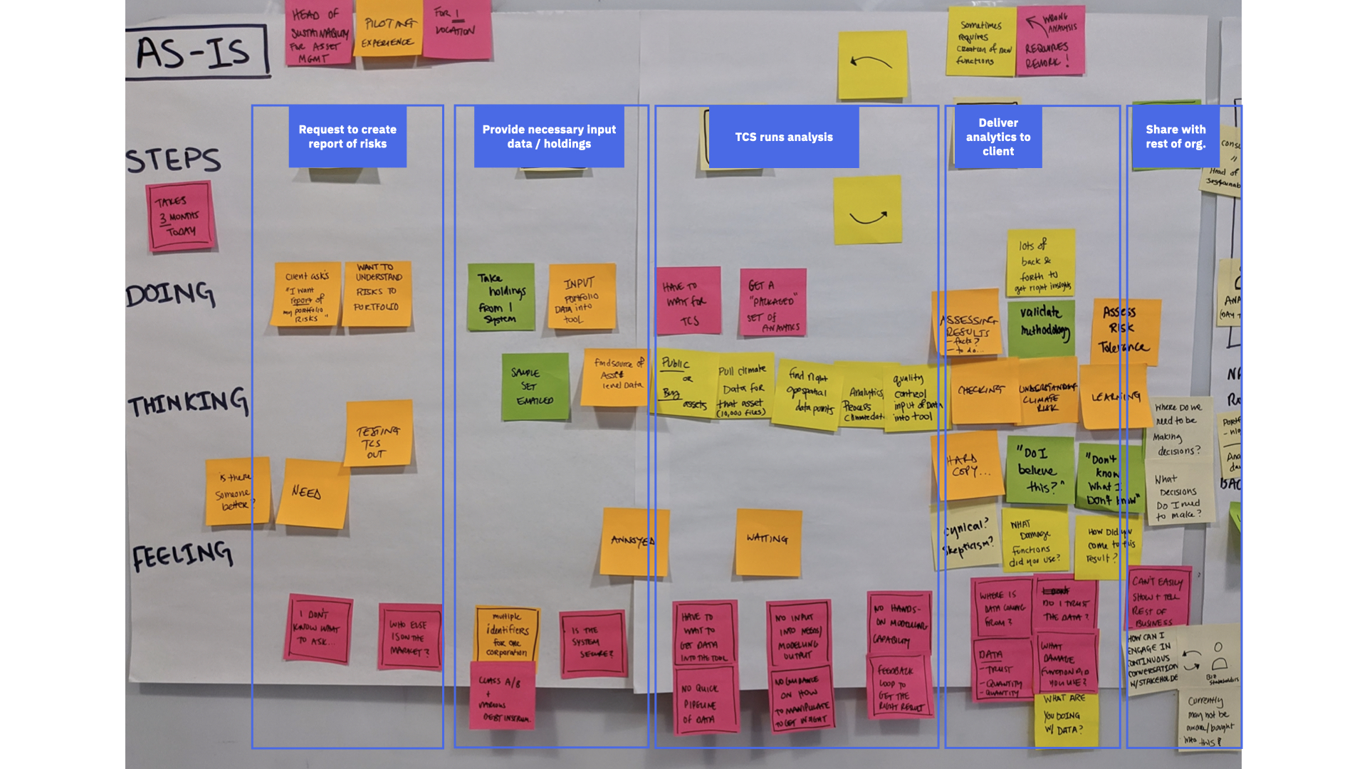
An as-is experience map helped everyone visualize their current end-to-end process for each user and identify major pain points and opportunities to solve for. This exercise revealed areas of overlap and differences in the way each user used the platform.
Key insights
- Asset Managers struggle to understand how climate changes should impact their business decisions. "We don't know what we don't know." Without much existing guidance on or standards for addressing climate change, it's hard to know what questions to ask and how to manipulate data to get actionable insights.
- Usability issues in the app make it challenging to interpret and gain any value from the data. Less than 10% of current registered users even use the platform. Instead, they rely on Data Analysts to find insights and create a report for them.
- The startup recognized that internal data analysts are oftentimes a necessary proxy user due to the early stage of the product and field of analytics. Not only do they use the dashboard to help clients QA their data and find insights, they also use the tool to discover new ways to visualize the data to uncover insights as well.
Envisioning a better future
The team ideated a range of needs statements that addressed the prioritized pain points to frame our vision for the new experience. This activity helped feature-focused participants step away from technical functionality and focus on real user needs to drive the solution vision.
HYPOTHESES AND MEASURING SUCCESS
Defining what we needed to learn.
With a clear product vision based on user needs, we defined the series of hypotheses we needed to test with experiments in order to mitigate the riskiest unknowns that could block us from achieving our goals.
We believe asset managers need and will use an interactive dashboard to understand their climate risks. [metrics omitted]
Our experiment
Create and test a web app that provides asset managers with an immediate understanding of their core climate risks from highest to lowest level of analysis.
DESIGN PROCESS
Primary goals
- Focus on validating the core climate risk information users need to make decisions. With a limited amount of time, I needed to make sure my design efforts were highly focused on the current hypothesis while keeping the larger vision in mind. The design needed to allow for new information and analytics to be elegantly layered in down the road.
- Design an end-to-end flow that brings immediate clarity to high-level climate risks and allows users to progressively drill into details to uncover deeper insights.
- Make it intuitive for the various types of asset managers and the range of skill, expertise, and extent to which they will be interacting with the data.
What can we learn from the current application?
A heuristic evaluation was extremely helpful for me to understand the power and potential of the analytics but it also confirmed a very engineer-driven experience.
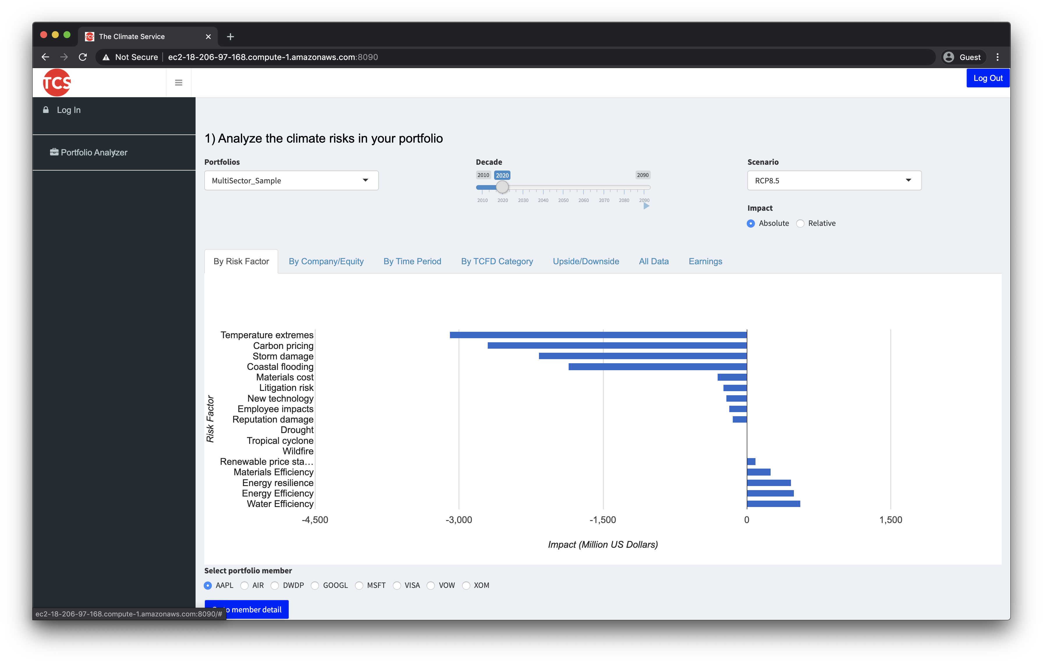 Existing application interface before redesign
Created with no design input, the end user application was also a sandbox to experiment with all of the possible ways to view and manipulate the data. Visualization overload, lack of content hierarchy, inconsistent filtering and formatting, jargon-laden language use, and ambiguous color usage all contributed to a "frankensteined" and confusing experience, even for the product team.
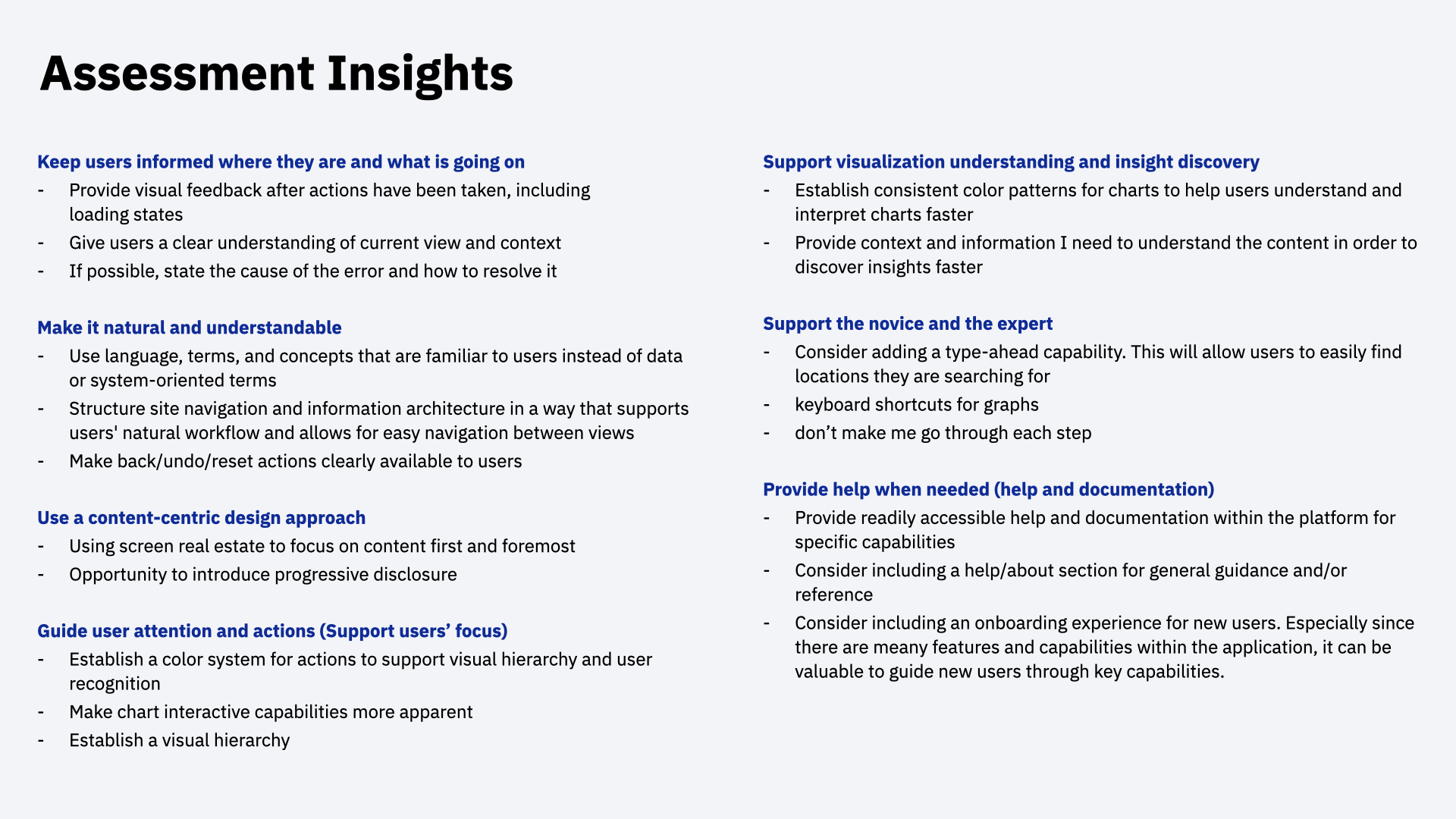 Heuristic evaluation and assessment insights
Driving infrastructure decisions
A few initial sketches of the end-to-end user flows quickly uncovered key architectural decisions that needed to be made. I worked closely with the product owner to define a flexible and scalable information architecture that matched our understanding of users' mental model. This hierarchy informed the database structure as well as how I designed the site architecture and content hierarchy.
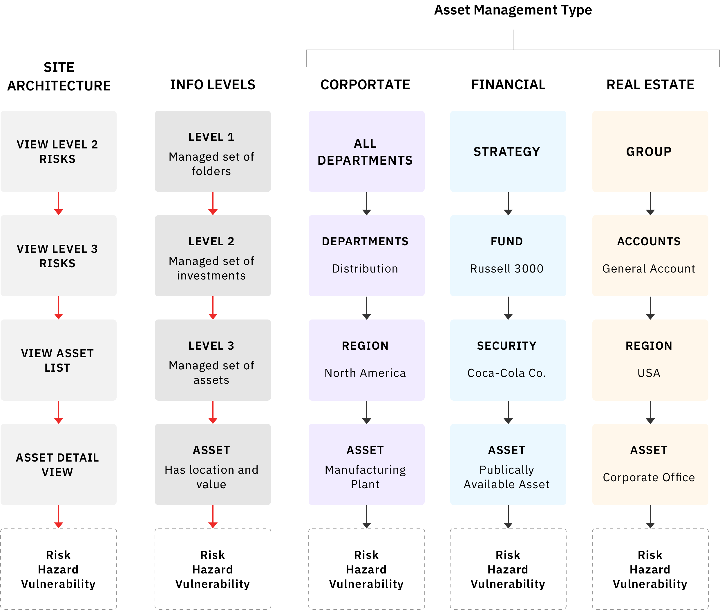 Scalable information architecture
Understanding question flows
I then worked with analysts to understand the different scenarios of use and the potential series of questions asset managers need to ask in order to arrive at actionable insights. These flows helped understand the core questions users have:
- What are my risks?
- Where are my risks?
- When do my risks occur?
This exercise helped the team understand the necessary data and visualizations for the core experience.
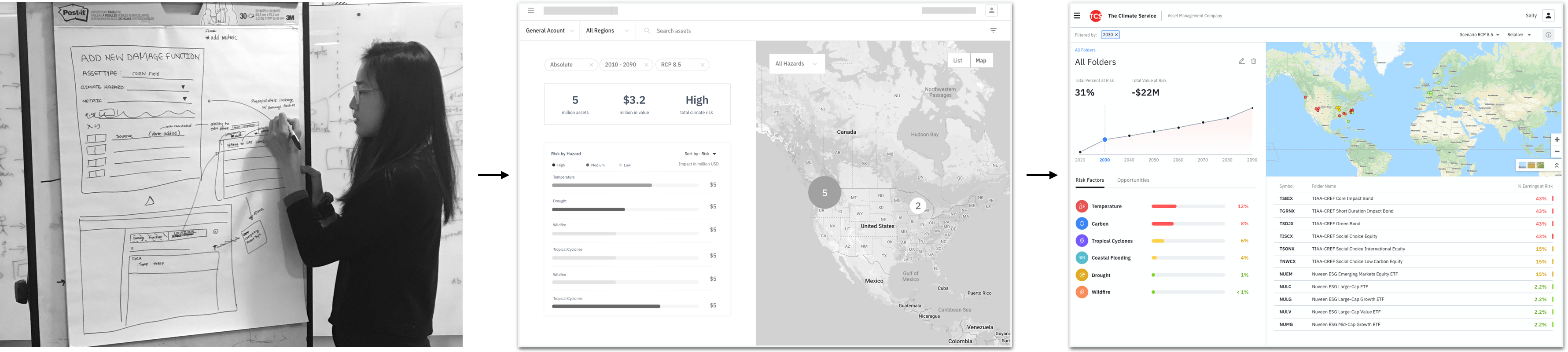
Sketches and wireframes
I used my understanding of the content and user flows to frame the way I structured and designed the content of the app in a way that matches the mental model for multiple users and supports their insight discovery process.
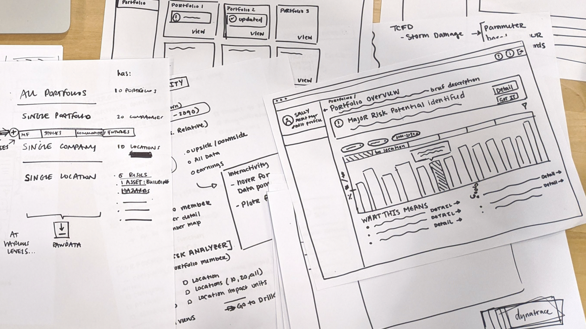
Once we had a clear enough definition of the preliminary end-to-end experience we hoped to achieve, I continued to iterate on designs with end user feedback to bring the wireframes to high fidelity prototypes.
FINAL DESIGN DECISIONS
Simplifying the analytics experience
The resulting dashboard provides asset managers with an at-a-glance summary of their climate risks and allows them to intuitively "drill down" to appropriate levels of detail.
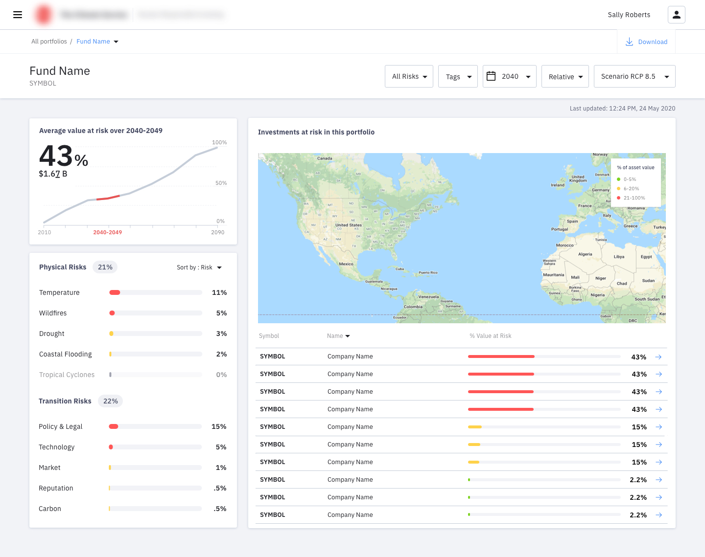 Final analytics dashboard experience
Clean and approachable
We kept the visual aesthetic clean and minimal, reserving colors for buttons and important information. We used cards to help break up the content and provide additional breathing room between data to support legibility.
At-a-glance summary
The initial dashboard provides a single view to immediately understand the most essential information without cluttering the screen.
Simplifying the visualizations
I worked closely with the analysts to design the appropriate visualizations that clearly communicate information asset managers need. Our goal was to eliminate unnecessary cognitive load to interpret graphs.
Easily interpret the data
Grouping related content and creating a natural hierarchy of content through the layout helps guide users to uncover insights in a way that's natural to them.
Making it easy to discover
Each section provides clear visual cues for users to then dig deeper into appropriate levels of detail to understand the "why" behind the data.
Meaningful colors and consistent formatting
"So, what do the colors mean?" Now, users won't need to ask that question anymore. I worked with our visual designer to establish a clear and approachable color system that supports the understanding of data being presented.
USER TESTING
Iterating with real users throughout.
A critical piece of my design process was including usability testing throughout the process. We had access to 4 data analysts who I would regularly play back design iterations to in order to make sure all of my decisions are driven by users. We were also able to test and get feedback with 5 current asset manager customers during the last week of the engagement.
Asset managers were excited by the type of results the platform provided but wanted more guidance on what the data means and flexibility for scenario analysis.
"I love seeing all information in one place."
"We're relying on you to tell us what we need to be concerned about."
In general, the positive usability feedback validated that the app provided the correct fundamental workflow and type of information needed by asset managers. I also gathered a lot of great feedback for additional hands-on capabilities to manipulate the data. This was a positive sign that we were moving in the right direction.
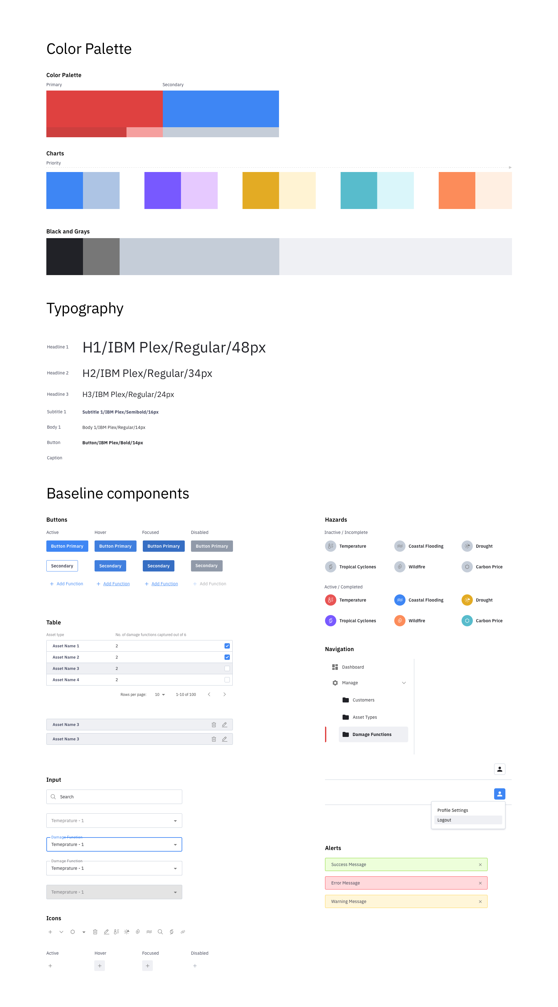
BRAND DIRECTION AND STYLE GUIDE
Establishing a visual identity for The Climate Service.
I worked closely with another visual designer from the IBM Garage, Ed, for a two-week sprint to establish a clear visual direction for the application. This style guide was also used to inform their upcoming website redesign.
MOVING FORWARDS
A strong foundation for continued iteration.
The first production release recently launched. We strongly recommended the client continue to test with end users to measure the success of our experiment. The feedback thus far has been extremely positive.
"I like the design, it's really clean and simple and easy to understand."
"It feels very familiar and user friendly."